TPT
Total:
$0.00

Scatter Plots & Lines of Fit Lesson/Task Cards/Video

Rated 5 out of 5, based on 2 reviews
5.0 (2 ratings)
;
Grade Levels
9th
Resource Type
Standards
Formats Included
  • Google Slides™
Pages
16 pages
$3.00
$3.00
Share this resource
Report this resource to TPT
Made for Google Drive™
This resource can be used by students on Google Drive or Google Classroom. To access this resource, you’ll need to allow TPT to add it to your Google Drive. See our FAQ and Privacy Policy for more information.

Description

You are purchasing an editable set of the Google Slides used to make this video. All slides are animated as seen in the video lesson. You may use these slides as a guided lesson, scaffolded class notes, print or share student practice slides as task cards, and/or adapt using Pear Deck for whole class instruction.

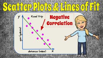
In this video lesson we will learn about the relationship between two data sets displayed in a a graph called a Scatter Plot. We will discover that a scatter plot display data represent two data sets to determine if there is a relationship. The relationship is referred to as correlation Correlation could be positive, negative or no correlation. The "trend" in the data could be linear or nonlinear. We will learn to draw a trend line that lies between the data points with as many data points above the line as below the line. We will use points on the line to write the equation of the line of fit. We will interpret the slope and y-intercept of the line and use the line to predict data not displayed on the graph. Student practice is embedded in the lesson with modeled exemplar solutions.

Magic of Math Website

Preview the Video Now!

Total Pages
16 pages
Answer Key
Included
Teaching Duration
N/A
Report this resource to TPT
Reported resources will be reviewed by our team. Report this resource to let us know if this resource violates TPT’s content guidelines.

Standards

to see state-specific standards (only available in the US).
Interpret the parameters in a linear or exponential function in terms of a context.
Fit a function to the data; use functions fitted to data to solve problems in the context of the data.
Fit a linear function for a scatter plot that suggests a linear association.
Interpret the slope (rate of change) and the intercept (constant term) of a linear model in the context of the data.

Reviews

Questions & Answers